.svg)
PSA Rebrand
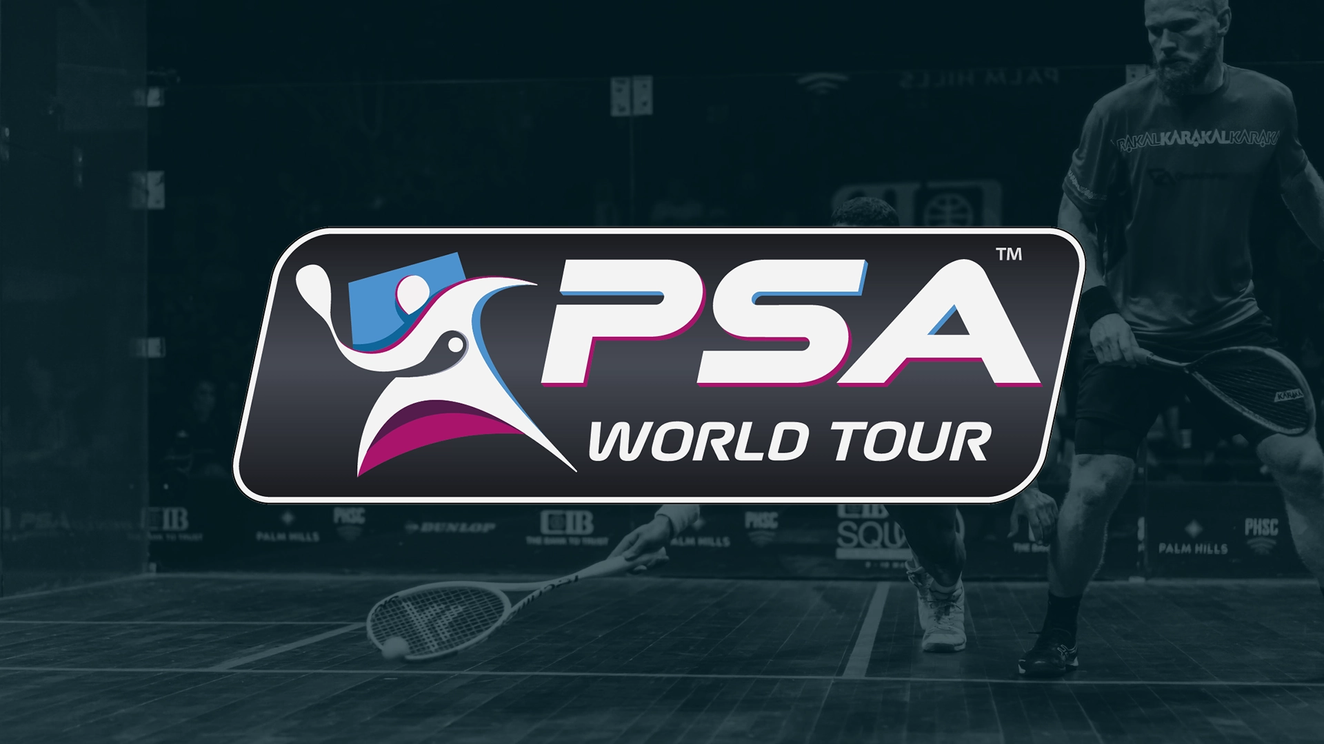
For a sport defined by blistering speed and gladatorial intensity, professional squash had a problem: its identity was standing still. For nearly a decade, the Professional Squash Association (PSA) relied on a static branding system: a lingering artifact of the 2015 merger between the men’s and women’s tours that depended on a binary of blue and pink to tell its story. But with the sport officially slated for the Olympic program and a new global audience on the horizon, the PSA needed a look that could keep pace with its athletes.
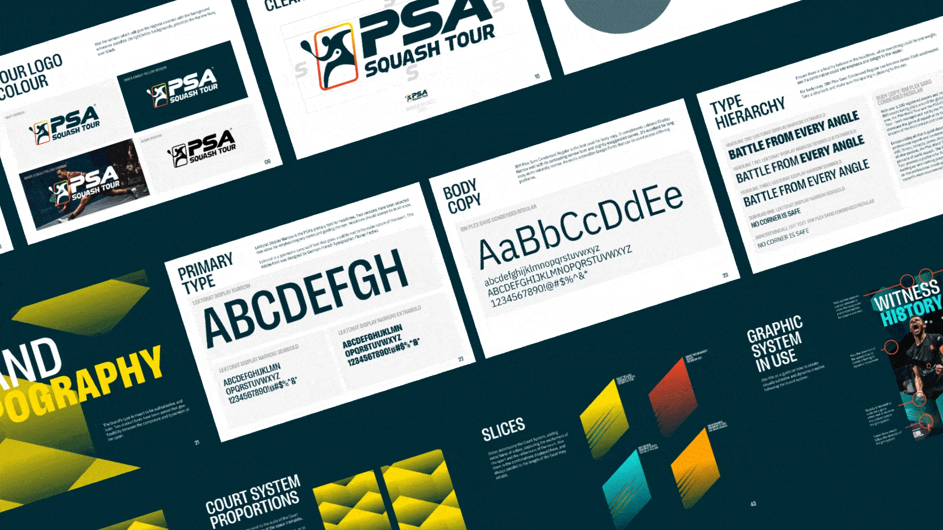
GAS created a framework to improve recognition, no matter the medium.
“The old branding was stereotyped, old fashioned, and traditional – blue and pink colours for men and women. It was time to signify the journey and what professional squash stands for, which is the excitement, the action, the passion, the incredible athletes, and the dynamic nature of the sport. "
- ALEX GOUGH
CHIEF EXECUTIVE, PSA
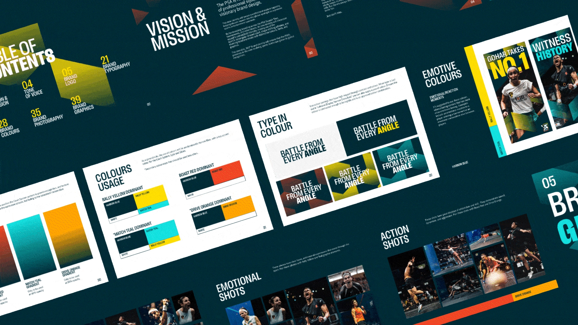
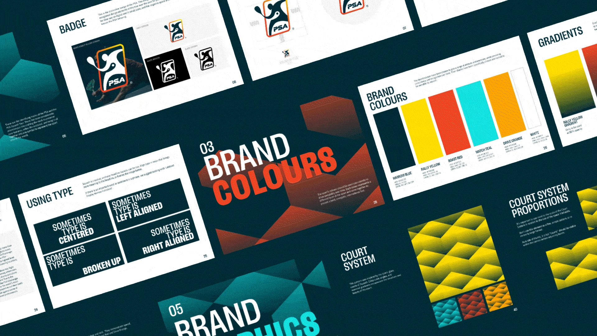
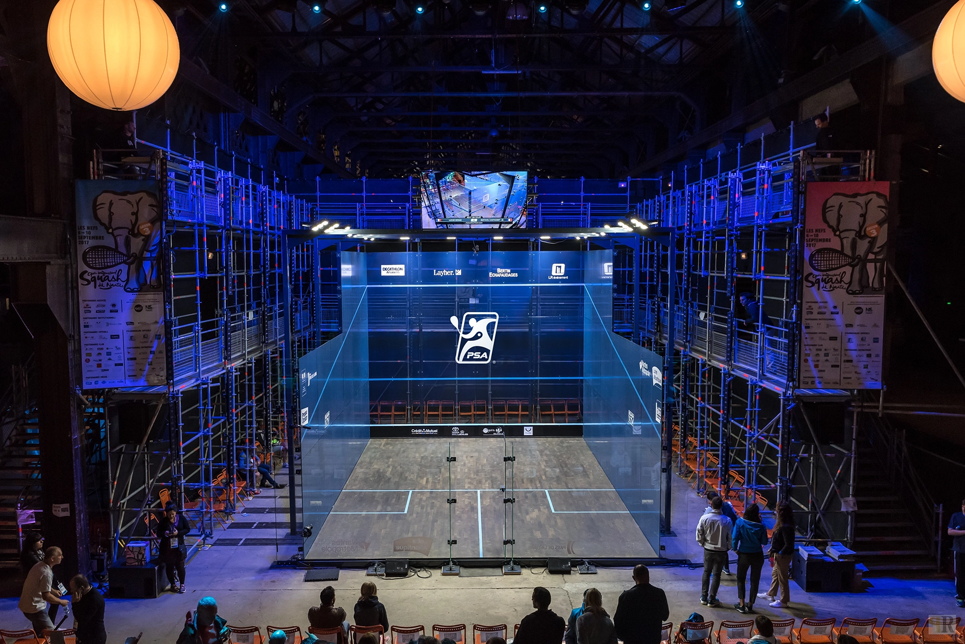
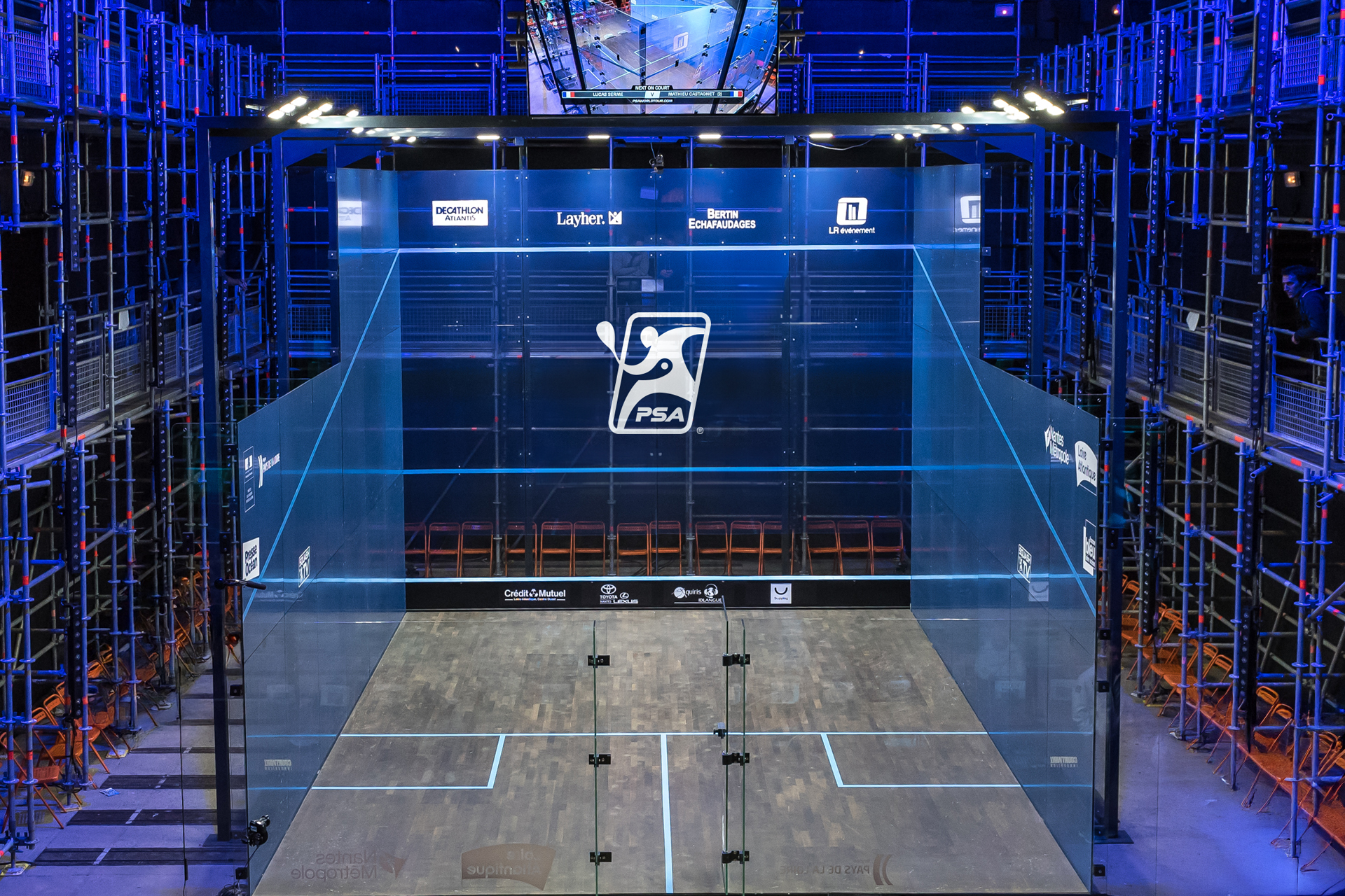
The overhaul, launching with the 2024-25 season, is more than a cosmetic refresh; it is a strategic repositioning. The name has shifted from the ambiguous "PSA World Tour" to the "PSA Squash Tour," a direct move to claim space in the minds of non-endemic viewers. But the real revolution is visual. GAS recognized that squash is uniquely a "dark sport"—played in dim venues under piercing theatrical lights—and built a palette to match.
“We stripped away the 'lint' from 50 years of brand building and created a clear blueprint for global partners to build with."
- ERIC NEAL
CREATIVE DIRECTOR, GAS
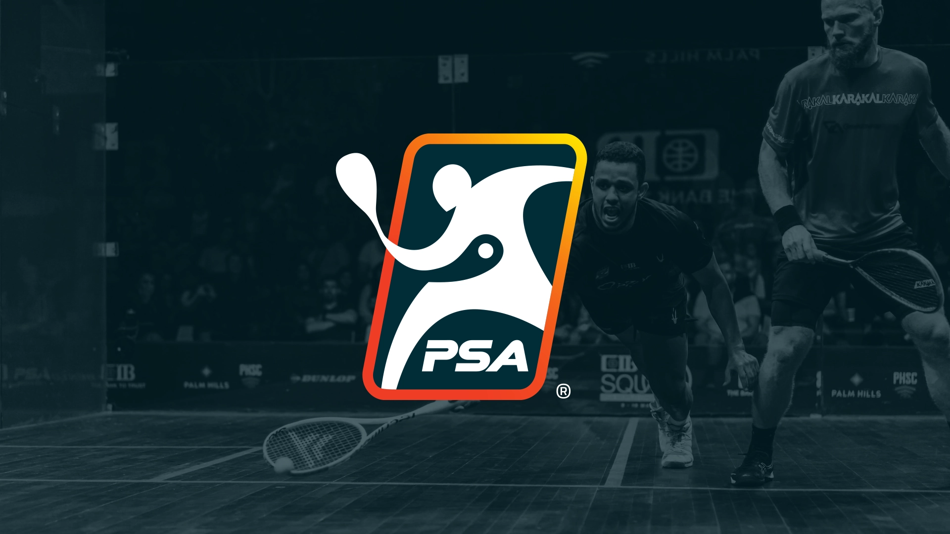

The old gendered system was replaced by the "Court System," a modular graphic device inspired by the court’s own geometry. It allows the brand to flex across digital and physical spaces, framing the action without overpowering it. By fusing deep heritage with a high-contrast, broadcast-ready aesthetic, GAS has given the PSA a fearless new face, one that proves the sport isn't just ready for the Olympics; it’s already playing at that level.